Every year Pantone will release what they believe to be the colour that will best represent the world for the upcoming 12 months. For 2016, Pantone have done something different; they have selected two official colours.
Their chosen colours are Rose Quartz & Serenity and are designed to be used together to create a balance and a soft and tranquil tone.
Here is how Pantone describe these colours:
“Rose Quartz is a persuasive yet gentle tone that conveys compassion and a sense of composure. Serenity is weightless and airy, like the expanse of the blue sky above us, bringing feelings of respite and relaxation even in turbulent times.”
How to use these colours in the home
These pastel shades feel fresh and uplifting compared to 2015’s colour of the year – Marsala, which was an earthy wine tone.
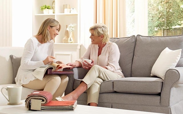
Rose Quartz and Serenity work well in the home, especially when used in accessories or accents. As these colours are designed to balance each other we suggest trying to use equal amounts of each. Too much pink and the overall look may be too sickly sweet; too much blue may be too cool.
These colours when combined together create a soft retro feel, which would work particularly well with Scandinavian style furniture.
Rose Quartz and Serenity will not be for everyone but will definitely add some fun and freshness to a colour scheme. What do you think of these colours? Comment below and tell us whether you’ll be incorporating these colours into your home this year